In today’s fast-paced business world, making sense of vast amounts of data can be challenging. That’s where data visualisation comes in – a world where numbers don’t just sit there but tell compelling stories. I have been using Power BI for around 5 years now and every time I run training courses on it people are astonished by what it can do. We have just launched a brand new Power BI Advanced Training course and would love to share why I think it is such an amazing tool, let me show you…
Why Power BI, You Ask?
Let me take you back to my humble beginnings with Excel, a tool I hold very dear. Excel is fantastic for crunching numbers, but when it comes to making those numbers pop and speak to you, Power BI is the tool you want, it is just incredible. They say, “A picture paints a thousand words” and in the realm of data, this is definitely true. Give me a list of numbers and it is hard to work out what they are saying. Transform those digits into graphs, gauges, or maps, and you have got yourself a captivating story.
Imagine you have a target you need to meet and want to be able to easily show how far off you are. In Excel, it’s a sea of numbers. However in Power BI you can show a dynamic gauge that fills up inch by inch as you edge closer to your goal, vividly showcasing your journey to success.
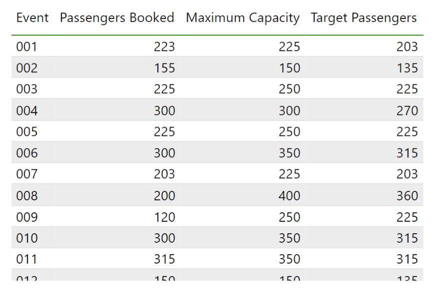
Excel Data
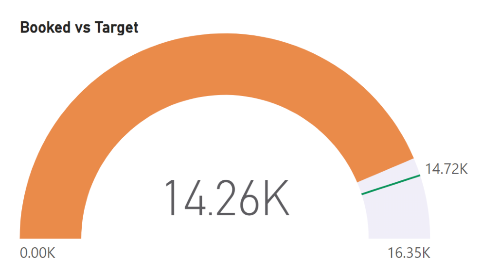
Power BI Dynamic Gauge
Mapping the World with Data
One of my favourite features in Power BI is its geographical data visualisation capabilities. Whether you are tracking global sales trends, pinpointing user hotspots, or unravelling shipment routes, Power BI’s mapping features are great. Clients I have worked with have used this to visually track equipment across the world and look at distributions of customers globally.
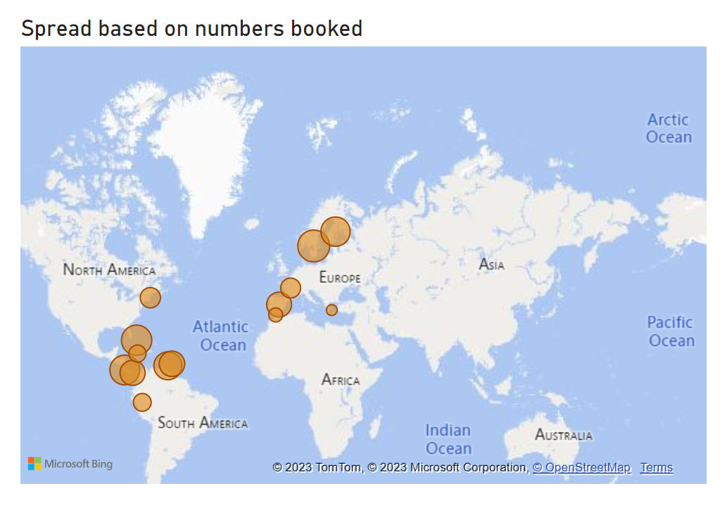
Customer Distribution
Crafting Your Own Data Style
With Power BI, you are not just limited to standard charts; you can download custom visuals to do so many different things. Imagine this: Instead of the typical bars in a bar chart, you could use custom images of your products. For instance, if you were giving a presentation about lorry shipments, you might want to use images of lorries instead of bars or if you were presenting passenger numbers replace the bars with silhouettes of people, giving a human touch to the data.
These tweaks don’t just make the data informative – they make it memorable. It’s all about making your presentation stand out, grab attention and resonate deeply with what is relevant for your audience.
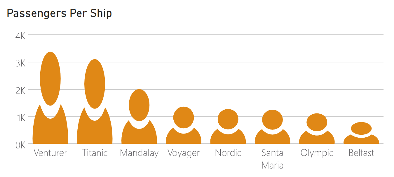
Passenger Numbers
Keeping Up with the Times
In my 5 year journey with Power BI, one of the aspects I have come to admire most is its dynamic evolution. It’s not just a static tool that you learn once and forget. It grows, changes, and adapts – much like the business world we live in.
When I started with Power BI, it already felt revolutionary. But as months turned into years, I noticed how the software received updates that were directly in tune with industry needs. Features that once seemed like a wish list became a reality and challenges that I once faced were addressed in newer versions.
This dynamism has ensured that as a data professional, I am not just keeping up with the times; I am often ahead, thanks to Power BI’s commitment to growth and adaptability.
Dive Deeper with Power BI – Advanced Reporting
Now, if you’re ready to take the plunge and unlock the full potential of Power BI, let me introduce you to our Power BI Advanced Reporting course. Here is a sneak peek at what’s in store:
- Fiscal Reporting: Learn how to sync up your data reporting with your company’s fiscal year. Say goodbye to the limitations of the standard calendar year.
- Calculated Insights: Take a deep dive into creating calculations. We will unravel the mysteries of Power Query Computed columns, DAX Calculated Columns, and Measures.
- Enhanced Visual Reporting: Get ready to explore advanced features like creating drill-through options, crafting interactive tool tip pages and automating your reports with slicers and action buttons.
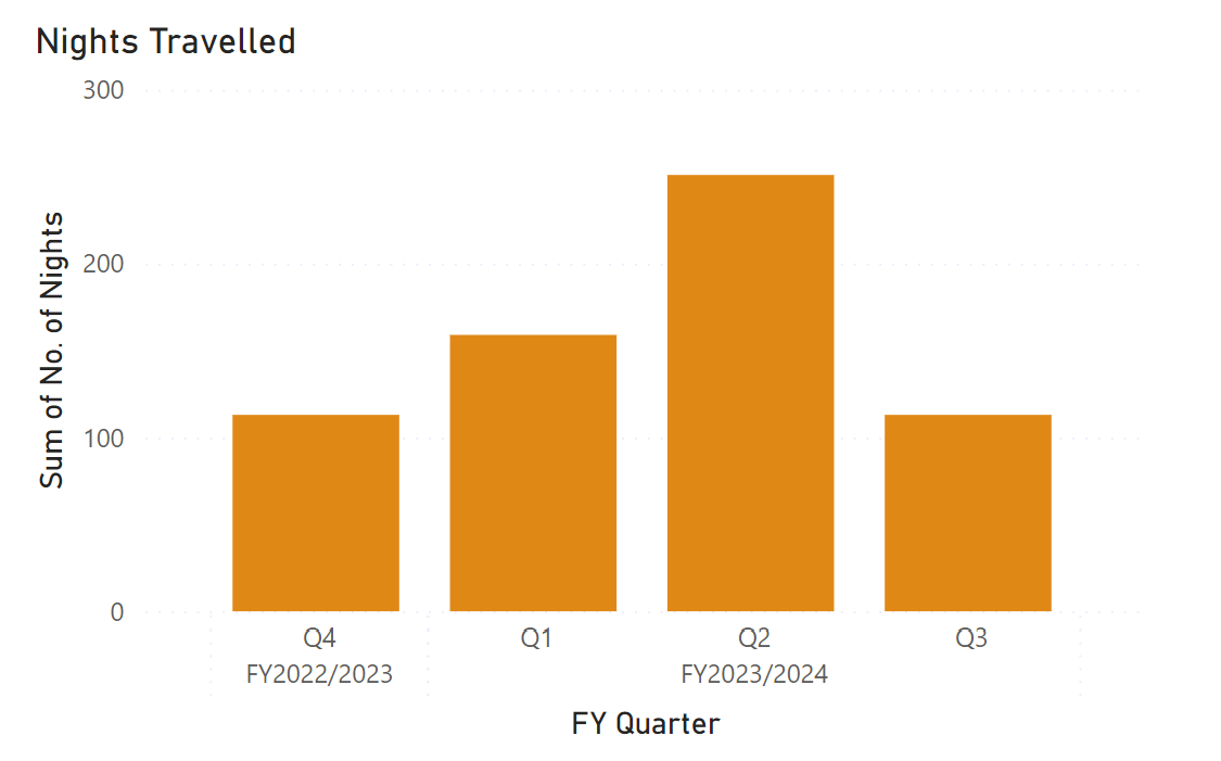
Fiscal Reporting

Enhanced Visual Reporting
If you are a beginner just starting out with Power BI, you might consider our Power BI – Introduction course to build a solid foundation. For those who have already embarked on this journey and are keen to push the boundaries, our Power BI – Advanced Reports course will take you to the next stage in your report development.
Let’s Wrap This Up
Data tells a story and with Power BI, I have found it easier to understand and share these stories. Over the last five years, I have seen how powerful it can be and I would love you to experience it too.
If you are thinking about trying Power BI or have questions I am always up for a chat about all things data.
Get in touch, and let’s get your Power BI journey started.
Recent blog posts:
Soft Skills: Why Being a Control Freak is Hurting Your Project Management Success
Are you a project manager who feels the need to be in control of every aspect of your project? While being detail-oriented and organised can be beneficial, it's important to recognise when your inner [...]
Becoming a Presenting Powerhouse: Mastering The Trifecta of Effective Presentations
Many people assume that some people are just born presenters. But we’re here to let you into a little secret - ANYONE can be a great presenter. And the best part? It isn’t even hard [...]
Keeping up to Date With Excel – Advanced Statistical Analysis
Excel plays such a huge part in most people’s everyday work and yet most people only use a small fraction of its capabilities. The trouble is, with Excel 365, they are adding new features [...]
Excel Power Query and Power Pivot
As we all know Excel is a very powerful tool, however sometimes where your data is spread across various spreadsheets and other files trying to summarize it all can be tricky. You can add [...]


